
On this page
You've written your questions. Now you have a pile of them in a document, and it looks like a ransom note. Which one goes first? Where do the instructions go? Should the rating questions sit in a grid? That's the job of a questionnaire format: the parts, the order and the layout that turn a list of questions into something people can finish.
This guide walks through the standard questionnaire format part by part. You'll see how to order questions, how to lay out each answer type, when a Likert grid helps and when it hurts, and what changes when the questionnaire goes online. The advice comes from survey researchers at the University of Florida and Pew Research Center, and at the end there's a blank questionnaire format template in Word and PDF.
The standard questionnaire format: five parts#
Almost every good questionnaire has the same skeleton. The details change with the topic, but the parts don't.
| Part | What goes in it | Why it matters |
|---|---|---|
| 1. Title block | A plain title, who it's from, the date and a "return by" date | People decide in seconds whether it's for them |
| 2. Introduction | Who is asking, why, how long it takes, by when, and who to contact | It's your only chance to explain why the answers matter |
| 3. Instructions | How to mark an answer, what to do if a question doesn't apply | Confused people skip questions or give up |
| 4. Sections of questions | Groups of questions by topic, each with a heading | Grouping keeps people's minds on one thing at a time |
| 5. Closing | A thank-you, what happens next, where to return it | It ends the conversation and tells people the effort counted |
Survey researchers at the University of Florida put the first and last parts plainly. Their extension guide on formatting says that when you count pages, you should "include both a welcome page" and a page with your thanks and contact details (UF/IFAS Extension, The Savvy Survey #7: Formatting Questionnaires, accessed 28 October 2026). The same guide calls a questionnaire "more than just a random list of questions". The format is what makes it more.
If you still need to write the questions themselves, start with our guide on how to write survey questions, and the step-by-step process for creating a questionnaire. Not sure whether you're building a survey or a questionnaire? We untangled the two words in survey vs questionnaire.
Question order: broad to narrow, sensitive last#
Order is the part of a questionnaire format people get wrong most often, because it feels like it shouldn't matter. It does. Pew Research Center explains that "earlier questions can unintentionally provide context for the questions that follow" (Pew Research Center, Writing survey questions, accessed 28 October 2026).
Pew gives a striking example. In a December 2008 poll, Pew asked people whether they were satisfied with the way things were going in the country right after a question about the president's job. Asked in that order, "88% said they were dissatisfied, compared with only 78% without the context of the prior question." Same question, different neighbor, a 10-point swing.
Both sources describe a good questionnaire the same way: like a conversation. Pew says a questionnaire "should be grouped by topic and unfold in a logical order." In practice, that gives you five rules.
- Start with an easy question everyone can answer. The Florida guide says the first question should "apply to everyone" and "be easy to read, comprehend, and answer". It should also make the topic obvious, so people know they're in the right place.
- Go broad before narrow. Ask for the overall view before the details. Pew notes that "asking a more specific question before a more general question" can shift the general answer.
- Group by topic, or by the order things happened. For a workshop, follow the day: arrival, first session, break, second session, wrap-up. The Florida guide says a timeline "makes recall easier for the survey taker".
- Put sensitive questions near the end. The Florida guide advises placing "sensitive or potentially objectionable items near the end of the survey", because by then people have already put time in.
- Put questions about the person last. Pew says "demographic questions such as income, education or age should not be asked near the beginning of a survey unless they are needed to determine eligibility for the survey or for routing respondents through particular sections of the questionnaire." Make them optional, and add "Prefer not to say".
There's one more order rule, and it's about grids. The Florida guide calls it "a poor practice to start a questionnaire with a long battery of questions in a grid format because this requires more cognitive effort and may cause respondents to quit." Save the grid for the middle.
Formats for each question type#
Each question type has a natural layout on paper and on screen. Pick one layout per type and use it everywhere. The Florida guide warns that switching formatting "in a haphazard or meaningless way just creates confusion."
| Question type | Paper layout | Online layout |
|---|---|---|
| Pick one (multiple choice) | Empty circles in a row or a column, one per option | Radio buttons, or a dropdown for long lists |
| Tick all that apply (checkboxes) | Empty squares, plus "None of these", with "(tick all that apply)" in the question | Checkboxes |
| Rating or 1 to 5 scale | Numbers in a row with both ends labelled | Linear scale with end labels, or a rating question |
| Agree or disagree statements | A grid: statements down the side, labels across the top | A matrix question |
| Open answer | Two or three ruled lines, more if you expect a lot | Long text box |
| Short fact (name, number, email) | One ruled line | Short text, number or email question |
| Order of preference | "Write 1 next to your top choice..." | A ranking question |
Circles for pick one and squares for tick all is a small trick that pays off on paper. People learn it on question one and stop thinking about it. The blank template below uses it throughout.
A few more format rules for each question:
- Number every question 1, 2, 3 all the way through, even across sections. The Florida guide says "it is appropriate for items to be numbered using a simple, consecutive number pattern." Numbers make skip instructions possible ("go to question 6").
- Put skip instructions right under the answer that triggers them. The Florida guide recommends arrows on paper: "A best practice is to use arrows to 'point the way.'"
- Line up the answer spaces. The guide notes that by "aligning the questions and corresponding answer spaces or categories, the respondents will be able to make sense of the survey's logic."
For the full list of question types and when each one fits, see every question type and when to use it.
Likert grids and matrix layout#
A Likert grid puts several statements on the same agree or disagree scale in one table. It's the most compact questionnaire format for a set of opinions, and the easiest one to overdo.
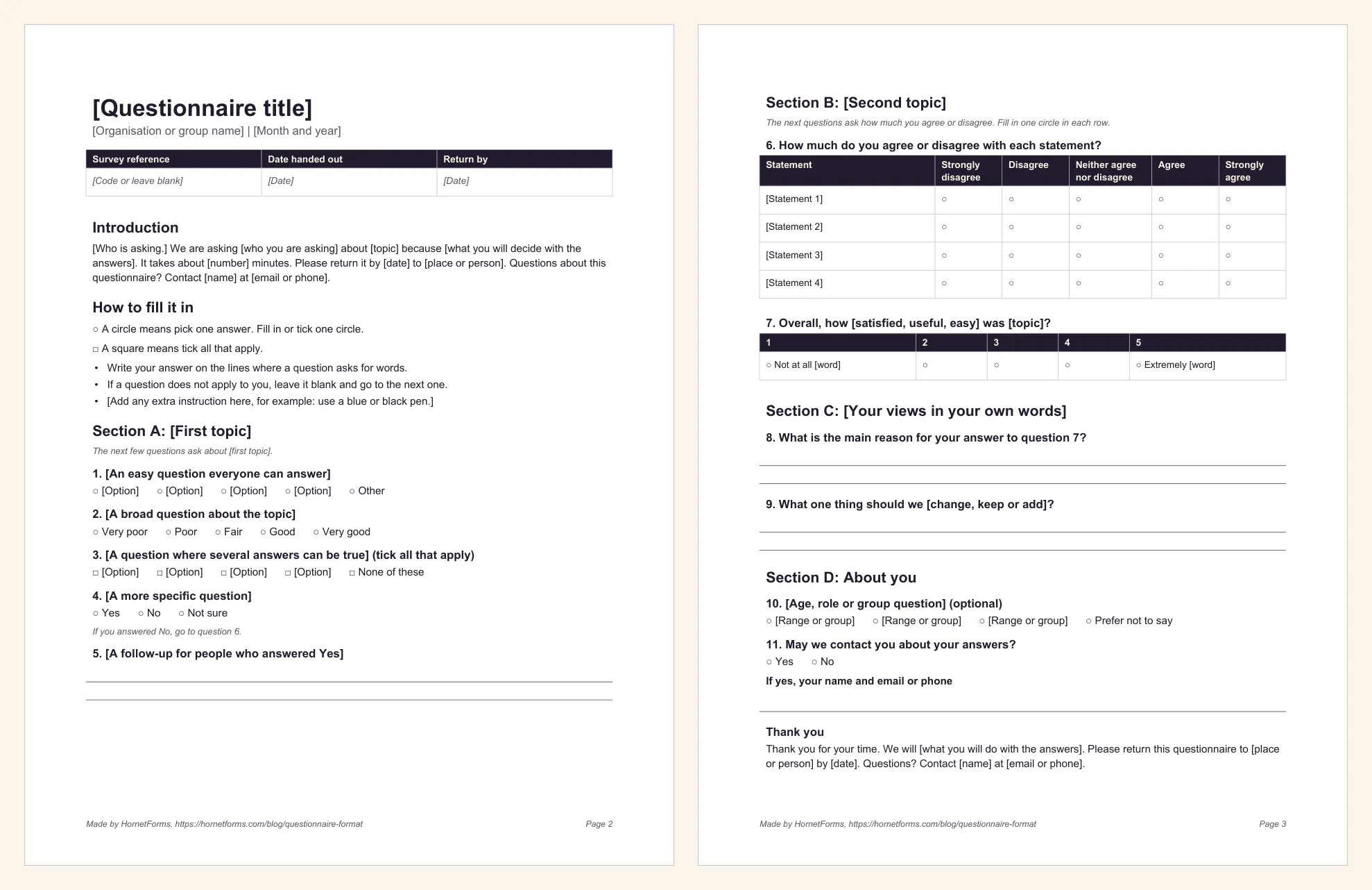
The blank template's questionnaire pages: Section A uses circles and squares, Section B holds the Likert grid.
Here's how to lay one out:
- Statements down the left, labels across the top. Five labels is the classic: Strongly disagree, Disagree, Neither agree nor disagree, Agree, Strongly agree.
- Keep the scale in the same direction everywhere. If "Strongly disagree" is on the left in one grid, keep it on the left in every grid.
- Keep grids short. Four to eight statements is plenty. A long block of identical rows invites people to tick the same column all the way down.
- Add a line above the grid. "Fill in one circle in each row" saves a lot of double ticks.
- Follow a grid with an open question. "What's the main reason for your answers?" turns a pattern of ticks into something you can act on.
Online, a grid becomes a matrix question. In HornetForms, a matrix takes up to 20 rows and 10 columns, with one answer per row or several. The Summary tab then shows the results as a table, with the count and share of each answer for each row. For a single statement, a linear scale is the better fit: you can label the ends of a linear scale with up to 100 characters each, such as "Not at all useful" and "Extremely useful".
Want help with the labels themselves? Our Likert scale survey guide has ready-made label sets and shows how to score the answers.
Paper and Word layout tips#
Paper still wins in some rooms: the end of a class, a front desk, a community hall with no Wi-Fi. A paper questionnaire format has a few rules of its own.
- Portrait, always. The Florida guide says paper questionnaires "should use a portrait orientation", with the format set by the paper size.
- Print in fours if you're making booklets. The same guide notes that "page counts using multiples of 4 provide the best use of paper resources", because one folded sheet makes four pages.
- Mark section starts. Give each section a heading and a short line like "The next few questions ask about the workshop." The Florida guide says that kind of transition "helps the respondent to shift gears mentally".
- Leave white space. Cramming two extra questions onto a page makes the whole thing look longer, not shorter.
- Never split a question across pages. Keep a question and all its answer boxes together.
- Use bold the same way every time. Bold for key words only, never whole sentences.
If you're building the questionnaire format in Word, a few habits save time:
- Use Word's heading styles for section titles, so the look stays the same everywhere.
- Build Likert grids as tables, and turn off the borders you don't need.
- Insert a page break before each section that must start on a new page, instead of pressing Enter until it moves.
- Want to edit with others? Upload the Word file to Google Drive and open it with Google Docs.
Online questionnaire format: one page or several#
Online, the parts stay the same, but the layout changes. You have three common setups:
| Layout | Good for | Watch out for |
|---|---|---|
| One long page | Short questionnaires of 10 questions or fewer | Long pages feel endless on a phone |
| Several pages, one section per page | Most questionnaires with clear sections | Too many tiny pages add clicks |
| One question at a time | Mobile audiences, short and simple questionnaires | Grids and long sections feel slow |
The Florida guide notes that "in online surveys, separate screens can be used to distinguish groups of questions." One section per page usually works best: the page heading does the job of the paper section heading, and people get a natural pause between topics.
A few things get easier online:
- Skips happen by themselves. Instead of "If you answered No, go to question 6", a show or hide rule only shows a question when an earlier answer makes it relevant. Our conditional logic guide walks through one.
- A progress bar replaces the page count. People can see how much is left.
- Required questions are a choice. Make the few questions you truly need required, and leave sensitive ones optional.
In HornetForms, all of that works on every plan: multi-page forms with a progress bar, a "One question at a time" layout, show and hide rules, and 20+ question types. The features page has the full list.
Download the blank questionnaire format#
We built the format from this guide into a blank template. It's three pages:
- Page one, how to use it. Seven steps for filling it in, and a table of answer formats with the matching online question type. Delete this page before you print.
- Page two, the start. A title block with a reference, date and "return by" date, an introduction with blanks for who, why, how long and who to contact, instructions on circles and squares, and Section A: an easy first question, a broad rating, a tick-all question, and a skip instruction with its follow-up.
- Page three, the rest. Section B with a Likert grid and a 1 to 5 scale with labelled ends, Section C with two open questions, Section D with optional "about you" questions and "Prefer not to say", and the thank-you.
Every bracket is a placeholder, so swap in your own topic and delete what you won't use.
- Word (DOCX), the easiest one to edit
- PDF, US Letter
- PDF, A4
Want a finished questionnaire instead of a blank format? Our questionnaire template is a ready-to-send 12-question feedback survey, and questionnaire examples has 10 more you can copy.
Build your questionnaire format online#
Once your paper version reads well, you can turn it into an online form without retyping it:
- Import the Word file. Upload your edited DOCX on the Import a form screen, and HornetForms' AI rebuilds it as a form for you to review. Each file uses one AI generation from your monthly allowance.
- Or start from a ready-made form. Browse the templates page for a survey close to yours, then swap in your own questions and keep the layout.
- Check the format in the preview. Put each section on its own page, turn the grid into a matrix question, and set the show rules that replace your paper skip instructions.
HornetForms takes unlimited responses within fair use on every plan, so a questionnaire that goes further than you planned keeps collecting. If you've ever hit a response limit halfway through a survey, you'll see why that matters. You can also turn on an email to yourself for each new response.
When the answers come in, our guide on how to analyze survey data shows how to count, cross-tab and report them. Ready to try it? Sign up for free and build your first questionnaire in the next 10 minutes.