
On this page
Most advice on form design best practices comes from companies that sell forms. That's not always bad advice, but it's hard to check. So this guide takes a different route: every rule below comes from a public design system or a web standard, and every one links to the page it came from.
The sources are the GOV.UK Design System and Service Manual, the U.S. Web Design System (USWDS) and the W3C, which writes WCAG 2.2 and the WAI Forms Tutorial. You get 20 rules, a free checklist and a scorecard to rate your own forms.
Where these form design best practices come from#
Each rule has a short quote and a link, so you can read the full guidance yourself. We accessed every page on 28 October 2026. You won't find conversion statistics here. Claims like "cut seven fields and double your sign-ups" usually trace back to a blog quoting another blog, and we couldn't find the study behind them. These form design best practices stand on their own.
Ask only what you need#
Every question costs your respondent time and attention. The first three form design best practices are about cutting questions, the cheapest fix there is.
Rule 1: Know why you're asking every question. The GOV.UK Service Manual says: "Only add a question if you know:" and its list starts with "that you need the information to deliver the service", "why you need the information" and "what you'll do with it" (GOV.UK Service Manual, Structuring forms, accessed 28 October 2026). It calls this list a "question protocol". Write one line per question: what it's for and who uses the answer. If you can't fill the line in, cut the question.
Rule 2: Ask for each piece of information once. "Make sure to only ask for a piece of information once within a single journey" (GOV.UK Design System, Question pages, accessed 28 October 2026). If your form asks for an email on page one, don't ask for it again on page three.
Rule 3: Put the "is this for me?" questions first. The Service Manual says to "Start with questions that will let users know if they're not eligible for the service, so you do not waste people's time." Then use branching so people skip what doesn't apply. In HornetForms, conditional logic can show, hide or jump past questions based on an answer. Our guide to conditional logic, answer piping and calculations walks through it.
Use one column#
Rule 4: Use one column. The USWDS form guidance says: "Use simple vertical layouts. Keep your form blocks in a vertical pattern" (U.S. Web Design System, Form, accessed 28 October 2026). It explains that a vertical pattern helps people with limited vision, who find it hard to scan from side to side.
Side-by-side fields still have a place for short pairs that belong together, like first name and last name. HornetForms column layouts put two or three blocks side by side on a page, and they stack back into one column on small screens. Use them sparingly, and keep the rest of the form in a single line down the page.
Put labels above fields#
Rule 5: Put a short label above each field. The GOV.UK text input guidance is direct: "You should align labels above the text input they refer to. They should be short, direct and written in sentence case. Do not use colons at the end of labels" (GOV.UK Design System, Text input, accessed 28 October 2026). The W3C agrees that labels above fields help "reduce horizontal scrolling for people with low vision and mobile device users" (W3C WAI Forms Tutorial, Labeling Controls, accessed 28 October 2026).
Rule 6: Never use placeholder text as the label. "Do not use placeholder text in place of a label, or for hints or examples," says the same GOV.UK page, because "it vanishes when the user starts typing". It also notes that "not all screen readers read it out". The grey text looks tidy in a mock-up. It's much less tidy when someone has typed half an answer and can't remember the question.
Rule 7: Keep hint text to one short sentence. GOV.UK suggests hint text "for help that's relevant to the majority of users", and warns: "Do not use hint text to explain anything that's longer than a short, simple sentence." Longer help belongs in a sentence above the question, or on its own page.
Mark optional questions, not required ones#
Rule 8: Mark optional questions with "(optional)". The GOV.UK question pages pattern says: "in most contexts, add '(optional)' to the labels of optional fields", and "Never mark mandatory fields with asterisks."
The U.S. Web Design System takes a slightly different line. It suggests marking required fields "by using a red asterisk ( * )" with a note at the top explaining it, and it agrees on the other half: "Label optional fields with the word “optional” placed in parentheses." So both systems put "(optional)" on optional questions. That's the part to copy.
Better still, follow rule 1 and remove most optional questions. If almost everything is required, the few optional ones stand out when they say so.
In HornetForms, every question starts optional, and you switch on "Required" for each question that needs an answer. Add "(optional)" to the question text of any that stay optional.
Group related questions into sections#
Rule 9: Group related questions under a heading. The W3C says: "Grouping related form controls makes forms more understandable for all users, as related controls are easier to identify" (W3C WAI Forms Tutorial, Grouping Controls, accessed 28 October 2026). It adds that groups let people "focus on smaller and more manageable groups rather than try to grasp the entire form at once".
Put the address fields together under "Your address", the contact fields under "How we can reach you", and so on.
One thing per page or one long page?#
This is the big layout choice, and it's where multi-step form examples from government services are most useful.
Rule 10: Start with one thing per page. The GOV.UK Service Manual says: "Start by splitting the form across multiple pages with each page containing just one thing". It lists what that helps people do, including to "use the service on a mobile device" and "recover easily from form errors". It also says user research will tell you when you can merge pages again.
Rule 11: Split long forms into logical steps. The W3C puts it this way: "Where possible, divide long forms into multiple smaller forms that constitute a series of logical steps or stages" (W3C WAI Forms Tutorial, Multi-page Forms, accessed 28 October 2026). A job application might run: about you, your experience, your documents, check and send.
Rule 12: Add a progress indicator only when people need it. This one surprises people. GOV.UK says: "Start by testing your form without a progress indicator to see if it's simple enough that users do not need one." And: "Try improving the order, type or number of questions before adding a progress indicator." If you do add one, keep it simple and accurate. The W3C suggests the first step should say how many steps follow.
HornetForms supports all three layouts:
- Multi-page forms. Type "/" in the editor and add a "New page" block wherever a new step should start.
- A progress bar. Switch "Show progress bar" on or off in the form's settings, after you've tried the form without it.
- One question at a time. Pick the "One question at a time" layout in the Design tab and each question gets the screen to itself.
| Your form | Try this layout |
|---|---|
| Three to five short questions (a contact form) | One page |
| Several groups of questions (an application) | One page per group, with a heading on each |
| A survey people answer on their phones | One question at a time |
| A long form where people ask "how much is left?" | Pages plus a simple progress bar |
Pick the right control for each answer#
Rule 13: Use radio buttons, not a dropdown, for short lists. GOV.UK is blunt about dropdowns: "The select component should only be used as a last resort in public-facing services because research shows that some users find selects very difficult to use" (GOV.UK Design System, Select, accessed 28 October 2026). Its research found people who couldn't close the list or tried to type into it. If there are only a handful of options, show them all as radio buttons.
Rule 14: Label every option, including both ends of a scale. WCAG 2.2 success criterion 3.3.2 (Level A) says: "Labels or instructions are provided when content requires user input" (WCAG 2.2, 3.3.2 Labels or Instructions, accessed 28 October 2026). A rating from 1 to 10 with no words leaves people guessing whether 1 is good or bad. In HornetForms you can label the ends of a linear scale, up to 100 characters each, such as "Not at all likely" and "Extremely likely".
Choosing between question types in general? Every question type, and when to reach for it covers all 20+ of them. And if the wording itself is the problem, see how to write survey questions people actually answer.
Error messages that help people fix things#
Rule 15: Say what went wrong and how to fix it. The GOV.UK error message guidance says: "Describe what has happened and tell them how to fix it. The message must be in plain English, use positive language and get to the point" (GOV.UK Design System, Error message, accessed 28 October 2026). It lists messages to avoid, including "An error occurred" and "This field is required", because they don't say what to do. "Enter your email address" does. The same page adds: "Do not clear any form fields when showing the Error message component."
Rule 16: Never show an error with colour alone. WCAG 2.2 success criterion 1.4.1 (Level A): "Color is not used as the only visual means of conveying information, indicating an action, prompting a response, or distinguishing a visual element" (WCAG 2.2, 1.4.1 Use of Color, accessed 28 October 2026). A red border on its own fails people who can't tell red from grey. Put words next to the field.
Good to know: the best error message is the one nobody sees. Clear labels, short hints and the right question type (rules 5 to 14) stop most mistakes before anyone presses the button.
Mobile form design best practices: tap targets and keyboards#
Many people will open your form on a phone, often from a link in a message or a QR code on a poster. Two rules matter most there.
Rule 17: Make tap targets at least 24 by 24 CSS pixels. WCAG 2.2 added success criterion 2.5.8 Target Size (Minimum) at Level AA: "The size of the target for pointer inputs is at least 24 by 24 CSS pixels" (WCAG 2.2, 2.5.8 Target Size (Minimum), accessed 28 October 2026). There are exceptions, for example when smaller targets have enough space around them. The plain-words version: radio buttons, checkboxes and buttons should be easy to hit with a thumb, and not crammed together.
Rule 18: Match the field type to the answer. GOV.UK tells developers to set inputmode to numeric for whole numbers "to use the numeric keypad on devices with on-screen keyboards", and to "Use the autocomplete attribute on text inputs to help users complete forms more quickly". WCAG 2.2 success criterion 1.3.5 Identify Input Purpose (Level AA) covers the same autofill idea. If you use a form builder rather than writing HTML, the lesson is simpler: use an email question for emails, a phone question for phone numbers and a number question for numbers, never one plain text box for everything.
These mobile form design best practices also cover length. One thing per page (rule 10) is the GOV.UK rule that names mobile devices directly.
Buttons that say what they do#
Rule 19: Write button text that says what happens. GOV.UK says: "Write button text in sentence case, describing the action it performs" (GOV.UK Design System, Button, accessed 28 October 2026). Its examples include "Save and continue" and "Pay". On question pages it also asks for a button "labelled 'Continue', not 'Next'".
"Submit" works, but "Send my application" or "Book my place" tells people exactly what they're about to do.
Test with real people before you launch#
Rule 20: Watch real people fill it in before launch. The GOV.UK Service Manual describes moderated usability testing as "where you watch participants try to complete specific tasks using your service", and asks people to "think aloud" while they do it (GOV.UK Service Manual, Using moderated usability testing, accessed 28 October 2026). It also says participants "need to be actual or likely users of your service".
You don't need a lab. Ask a few people who match your audience to fill in the form on their own phones while you watch and keep quiet. Note every pause, every reread question and every error. Testing is the one rule in this list of form design best practices that checks all the others.
After launch, keep an eye on the numbers. The HornetForms built-in analytics show views, starts, completions and approximate drop-off (the last question a visitor touched), so you can see which question to look at first. For surveys, our guide to survey response rate explains how to work out and raise the share of people who answer. And keep spam checks out of real people's way too: here's spam protection that doesn't annoy humans.
All 20 form design best practices on one page#
Here's the full list, with the source for each rule.
| No. | Rule | Source |
|---|---|---|
| 1 | Know why you're asking every question | GOV.UK Service Manual, Structuring forms |
| 2 | Ask for each piece of information once | GOV.UK Design System, Question pages |
| 3 | Put the "is this for me?" questions first | GOV.UK Service Manual, Structuring forms |
| 4 | Use one column | U.S. Web Design System, Form |
| 5 | Put a short label above each field | GOV.UK Design System, Text input |
| 6 | Never use placeholder text as the label | GOV.UK Design System, Text input |
| 7 | Keep hint text to one short sentence | GOV.UK Design System, Text input |
| 8 | Mark optional questions, not required ones | GOV.UK Design System, Question pages |
| 9 | Group related questions under a heading | W3C WAI Forms Tutorial, Grouping Controls |
| 10 | Start with one thing per page | GOV.UK Service Manual, Structuring forms |
| 11 | Split long forms into logical steps | W3C WAI Forms Tutorial, Multi-page Forms |
| 12 | Add a progress indicator only when people need it | GOV.UK Design System, Question pages |
| 13 | Use radio buttons, not a dropdown, for short lists | GOV.UK Design System, Select |
| 14 | Label every option, including both ends of a scale | WCAG 2.2, 3.3.2 (Level A) |
| 15 | Say what went wrong and how to fix it | GOV.UK Design System, Error message |
| 16 | Never show an error with colour alone | WCAG 2.2, 1.4.1 (Level A) |
| 17 | Make tap targets at least 24 by 24 CSS pixels | WCAG 2.2, 2.5.8 (Level AA) |
| 18 | Match the field type to the answer | GOV.UK Design System, Text input |
| 19 | Write button text that says what happens | GOV.UK Design System, Button |
| 20 | Watch real people fill it in before launch | GOV.UK Service Manual, Using moderated usability testing |
Accessibility goes deeper than rules 14, 16 and 17. We cover it in a separate accessible forms guide with a WCAG 2.2 checklist.
Free form design checklist and scorecard#
Two free downloads turn these form design best practices into a review you can repeat:
- The form design review checklist puts all 20 rules on two pages, each with a tick box and its source link. Print it and go through a form with a pen: checklist (PDF, US Letter) or checklist (PDF, A4).
- The form design scorecard (Excel) rates up to five forms side by side. Pick Pass, Fail or Not relevant for each rule, and the sheet counts passes and fails, works out a score and shows the fails by section. The score is passes divided by passes plus fails, so a short form isn't marked down for rules it doesn't need. Every rule links to its source. Get the form design scorecard (Excel), or the rules as a CSV for your own tools.
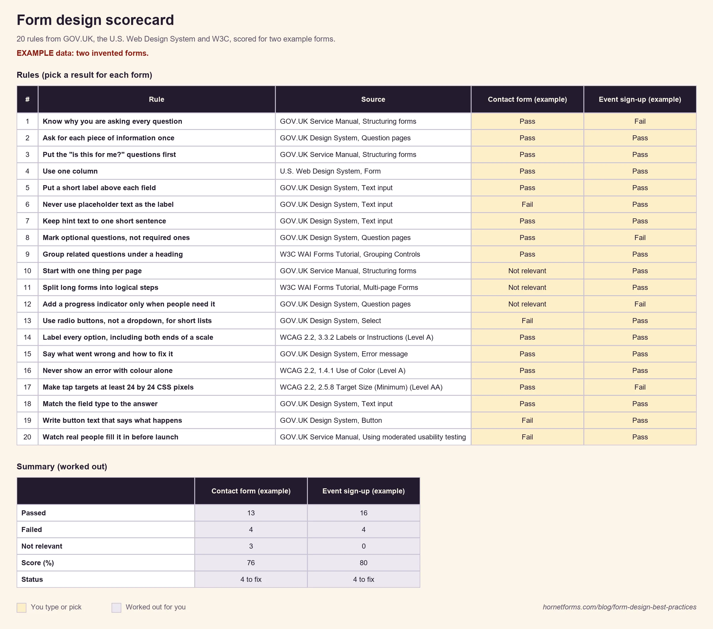
Example data only, invented for this guide.
The example contact form fails on placeholder labels, a dropdown with three options, a "Submit" button and no testing. Most are quick fixes, which is the usual story: most forms get better with an afternoon of small edits, not a rebuild. If the form you're reviewing is still a Word file, here's how to make a fillable form from it first.
Put these rules into your next form#
Start with rule 1 and delete what you don't need. Then put labels above fields, mark the optional questions and test the form on a phone with a real person. If you're starting from scratch, our step-by-step guide on how to create an online form covers the build from the first question to sharing the link.
HornetForms gives you multi-page forms, a progress bar you can switch on, the "One question at a time" layout, column layouts that stack on phones and labelled scales on every plan, including Free. There's more on the features page. If you're weighing it up against Google Forms, here's how HornetForms compares. Sign up for free and run your next form through all 20 form design best practices.