
On this page
A form is often the one thing on a page that people must use, not just read. A sign-up, an application, a booking, a complaint. If someone can't reach a field with a keyboard, can't hear what a box is for, or can't tap a tiny radio button, the form stops them cold. Accessible forms fix that, and they are easier for everyone else too. If your form is still a Word file people print, start by turning it into a fillable form they can complete online.
This guide walks through accessible forms the way the standard does. You get the WCAG 2.2 success criteria that matter most on a form, what each one asks in plain words, and a test you can run yourself in about 20 minutes. At the end you get a free checklist as a PDF and a spreadsheet that counts passes and fails.
One note before we start: this is a practical guide, not legal advice. Laws differ by country and by sector, so ask your own adviser what applies to you.
Why accessible forms matter#
The W3C's Web Accessibility Initiative (WAI) puts it simply in its Forms Tutorial: "Forms can be visually and cognitively complex and challenging to use. Accessible forms are easier to use for everyone, including people with disabilities." (W3C WAI, Forms Tutorial, accessed 28 October 2026)
The same page lists who gains the most, including this: "People using screen readers can identify and understand form controls more easily because they are associated with labels, field sets, and other structural elements."
Keyboards matter just as much. Section508.gov, the US government's accessibility site, says: "People with mobility disabilities, people who are blind or have low vision, and others may rely on a keyboard or assistive technology that works like a keyboard to navigate and interact with digital content" (Section508.gov, Check for Keyboard Accessibility, accessed 28 October 2026).
The W3C's business case adds the wider point: "Accessibility often improves the online experience for all users" (W3C WAI, The Business Case for Digital Accessibility, accessed 28 October 2026). Think of the parent filling in a form one-handed on a phone.
WCAG 2.2 in two minutes#
The rules most teams use are the Web Content Accessibility Guidelines (WCAG). Version 2.2 became a W3C Recommendation on 5 October 2023, and W3C says it "provides 9 additional success criteria since WCAG 2.1" (W3C WAI, What's New in WCAG 2.2, accessed 28 October 2026). It also dropped one: "4.1.1 Parsing is obsolete and removed from WCAG 2.2."
Each success criterion has a level: A, AA or AAA. Most targets are Level AA, which builds on A: "For Level AA conformance, the web page satisfies all the Level A and Level AA success criteria" (W3C, WCAG 2.2, accessed 28 October 2026). Every number and level here comes from that page.
Labels and instructions#
Start here, because almost every other rule leans on labels. Success criterion 3.3.2 Labels or Instructions (Level A) reads: "Labels or instructions are provided when content requires user input."
The WAI tutorial gets more specific: "Provide labels to identify all form controls, including text fields, checkboxes, radio buttons, and drop-down menus." Then it explains why the code link matters. Tie a label to its field and "Web browsers provide the label as a larger clickable area", and assistive technology can "refer to the correct label when presenting a form control" (W3C WAI, Labeling Controls, accessed 28 October 2026). That link in the code is 1.3.1 Info and Relationships (Level A).
Three habits cover most of it:
- A visible label for every field. Placeholder text is not a label. WAI warns that "placeholder text is not a replacement for labels" and that screen readers "do not treat placeholder text as labels" (W3C WAI, Form Instructions, accessed 28 October 2026).
- Group related choices. A set of radio buttons needs a group name, like "Preferred contact method", so a screen reader reads the question before the options.
- Say the format up front. If you need a date in a set way, say so in the label, not only in an error after the fact.
Keep the visible label and the label in the code the same, too. That's 2.5.3 Label in Name (Level A), and it's what lets a voice control user say "click Email" and land in the right box. Labels should also describe their purpose (2.4.6 Headings and Labels, Level AA). "Name" is fine. "Field 3" is not.
The right question type helps too: a date question beats a text box with "DD/MM/YYYY" in grey. See every question type and when to use it.
Required fields and error messages#
Errors are where accessible forms most often break.
3.3.1 Error Identification (Level A): "If an input error is automatically detected, the item that is in error is identified and the error is described to the user in text."
3.3.3 Error Suggestion (Level AA): "If an input error is automatically detected and suggestions for correction are known, then the suggestions are provided to the user", with a narrow exception in the spec.
In practice:
- Put the error in words, next to the field. A red border alone fails people who can't see red. That's also 1.4.1 Use of Color (Level A): "Color is not used as the only visual means of conveying information."
- Say how to fix it. "Invalid" tells nobody anything. "Enter an email address like name@example.com" does.
- Mark required fields in text. WAI's own example label reads "Name (required)" (W3C WAI, Validating Input, accessed 28 October 2026). An asterisk works if you explain it at the top of the form.
- Let screen readers hear the summary. Screen readers should announce a message like "Two answers need fixing" without moving focus (4.1.3 Status Messages, Level AA).
Forms that take money or make a legal commitment add 3.3.4 Error Prevention (Legal, Financial, Data) (Level AA): people can undo, fix flagged errors, or review and confirm answers "before finalizing the submission."
In HornetForms, questions are optional by default, and you switch on Required for each question people must answer. Fewer required fields means fewer errors to begin with.
Keyboard and focus#
Every part of a form must work without a mouse. 2.1.1 Keyboard (Level A) says: "All functionality of the content is operable through a keyboard interface". 2.1.2 No Keyboard Trap (Level A) adds that once focus enters a component, it must be able to leave by keyboard too.
Section508.gov's test: "One of the easiest ways to identify keyboard accessibility problems is to try navigating the web without your mouse." Two of its questions are "Can I tell which element currently has keyboard focus?" and "Does the focus move in an order that makes sense?" They map to these criteria:
| Criterion | Level | What it means on a form |
|---|---|---|
| 2.4.3 Focus Order | A | Tab moves through fields in an order that keeps the meaning, usually top to bottom |
| 2.4.7 Focus Visible | AA | You can always see which field or button has focus |
| 2.4.11 Focus Not Obscured (Minimum) | AA (new in 2.2) | A focused field is never fully hidden by a sticky header, a cookie banner or a chat button |
| 3.2.2 On Input | A | Picking an option doesn't submit the form or jump to a new page without warning |
Time limits count too: if a form has one, 2.2.1 Timing Adjustable (Level A) asks that people can turn it off, adjust it or extend it.
Colour and contrast#
Two contrast rules matter on a form, and they cover different things.
1.4.3 Contrast (Minimum) (Level AA) is for text: "The visual presentation of text and images of text has a contrast ratio of at least 4.5:1", or 3:1 for large text. That includes labels, help text and the words on buttons.
1.4.11 Non-text Contrast (Level AA) is for the controls themselves. Visual information "required to identify user interface components and states" needs "a contrast ratio of at least 3:1 against adjacent color(s)." On a form, that means field borders, checkbox and radio outlines, and focus rings. W3C's Understanding page sums it up: "Some people cannot see elements with low contrast" (W3C, Understanding Non-text Contrast, accessed 28 October 2026).
The usual failure is a pale grey border on white. It looks clean, and it makes the boxes vanish for anyone with low vision. That's like hiding the door handle to keep the door tidy.
HornetForms comes with nine theme presets, and you can set your own colours. If you pick your own, the Design tab warns when a primary colour has low contrast against the form background. It's a warning, not a block, so treat it as a to-do. Styling a Google Form? Our guide on how to customize Google Forms covers its theme colours, so check contrast there too.
Target size and zoom#
Fingers are bigger than mouse pointers. 2.5.8 Target Size (Minimum) (Level AA) is new in WCAG 2.2: "The size of the target for pointer inputs is at least 24 by 24 CSS pixels", with exceptions. The main one is spacing: a smaller target passes if a 24 CSS pixel circle centred on it doesn't touch another target or its circle.
W3C's Understanding page explains why: "Some people with physical impairments cannot click small buttons that are close together" (W3C, Understanding Target Size (Minimum), accessed 28 October 2026). A label tied to its checkbox helps here too, because the label becomes part of the clickable area.
Two zoom rules round this out:
- 1.4.4 Resize Text (Level AA): text "can be resized without assistive technology up to 200 percent without loss of content or functionality."
- 1.4.10 Reflow (Level AA): content works "without requiring scrolling in two dimensions" at "a width equivalent to 320 CSS pixels." That equals a 1280 pixel wide window at 400% zoom.
Layout and spacing advice beyond accessibility lives in our form design best practices post, built from government design systems.
Redundant entry and accessible authentication#
Two more new WCAG 2.2 criteria target memory and effort.
3.3.7 Redundant Entry (Level A) says information "previously entered by or provided to the user that is required to be entered again in the same process is either: auto-populated, or available for the user to select." W3C's short version: "Don't ask for the same information twice in the same activity" (W3C, Understanding Redundant Entry, accessed 28 October 2026).
In HornetForms, two features help:
- URL prefill. Give a question a "Prefill parameter" and fill it from the link, so a member's link already holds their name and member number.
- Booking questions. A scheduling question can take the booker's name and email from earlier answers in the form.
3.3.8 Accessible Authentication (Minimum) (Level AA) is about logins: "A cognitive function test (such as remembering a password or solving a puzzle) is not required for any step in an authentication process" unless there's another way through. W3C's plain version: "Don't make people solve, recall, or transcribe something to log in" (W3C, Understanding Accessible Authentication (Minimum), accessed 28 October 2026). Letting password managers fill fields, and allowing paste, both help.
Most public forms ask nobody to log in, so this one often doesn't apply. The idea still does: skip the picture puzzle. HornetForms' built-in spam checks (a honeypot, a time check and rate limits) run in the background and ask respondents to solve nothing. Our post on spam protection that doesn't annoy humans explains how they work.
Test your form in 20 minutes#
You don't need a lab. Section508.gov tells teams to pair automated checks with people: "Perform manual accessibility testing for requirements not fully covered by automation, including keyboard navigation, focus order, meaningful alternative text, accurate labeling, heading structure, and use of color" (Section508.gov, Integrating Section 508 Requirements into Each Agile Sprint, accessed 28 October 2026).
Here's a 20-minute pass for one form:
- Keyboard (five minutes). Put the mouse away. Tab, Shift+Tab, Enter, Space and the arrow keys only. Fill in every field, open every dropdown and date picker, and submit.
- Errors (three minutes). Submit the form empty. Then enter a bad email. Read every error out loud: does it say what's wrong and how to fix it?
- Zoom (three minutes). Zoom to 200%, then 400% on a laptop window. Nothing should be cut off, and nothing should scroll sideways.
- Phone (three minutes). Fill it in with one thumb. Every checkbox, radio button and button should be easy to hit.
- Screen reader (five minutes). NVDA is free on Windows, and VoiceOver comes built into Apple devices. Tab through and listen. Does each field announce its label, and each group its question?
- Automated check (one minute). Run a browser accessibility checker. It catches missing labels and contrast problems quickly, but it finds only part of what the manual steps find.
Test the form where people meet it: the public link, the page where you embed it, or the QR code for the form on your poster. A form can pass alone and fail under a sticky header (hello, 2.4.11).
What HornetForms targets#
HornetForms targets WCAG 2.2 Level AA for its public forms, with automated accessibility checks (axe) on 19 screens in CI. "Targets" is the honest word: automated checks find only part of the problems, so run the 20-minute pass on your own form too.
A few things that help on every plan:
- Respondent text in 12 languages. Buttons and messages that respondents see come in 12 languages, and forms in right-to-left languages get a right-to-left layout. Translating your own questions into up to 10 languages comes with Pro and Business. Our guide to multilingual and right-to-left forms shows how it works.
- Multi-page forms with a progress bar. WAI's Multi-page Forms tutorial suggests splitting long forms into steps and showing progress, "particularly for people who are less experienced using computers or who have various cognitive disabilities" (W3C WAI, Multi-page Forms, accessed 28 October 2026).
- A "One question at a time" layout that keeps each screen simple.
- Labelled scale ends. Linear scale questions can label both ends, like "Not at all" and "Extremely", up to 100 characters each.
More is on the features page, and plans are on the pricing page.
Download the accessible forms checklist#
The free checklist covers 28 WCAG 2.2 success criteria at levels A and AA that matter on a form, grouped by topic much like this post. Each one carries its number, name and level from the W3C spec, with the four new in 2.2 marked.
- Accessible forms checklist (PDF, US Letter) and A4 PDF: two pages with the 20-minute quick test, then a tick box for each of the 28 criteria.
- Accessible forms checklist (Excel): one row per criterion with what to check and how to test. Pick Pass, Fail or Not applicable, add a note, and the Score tab counts passes, fails and rows not checked yet, by level.
- Checklist rows as CSV, if you'd rather build your own tracker.
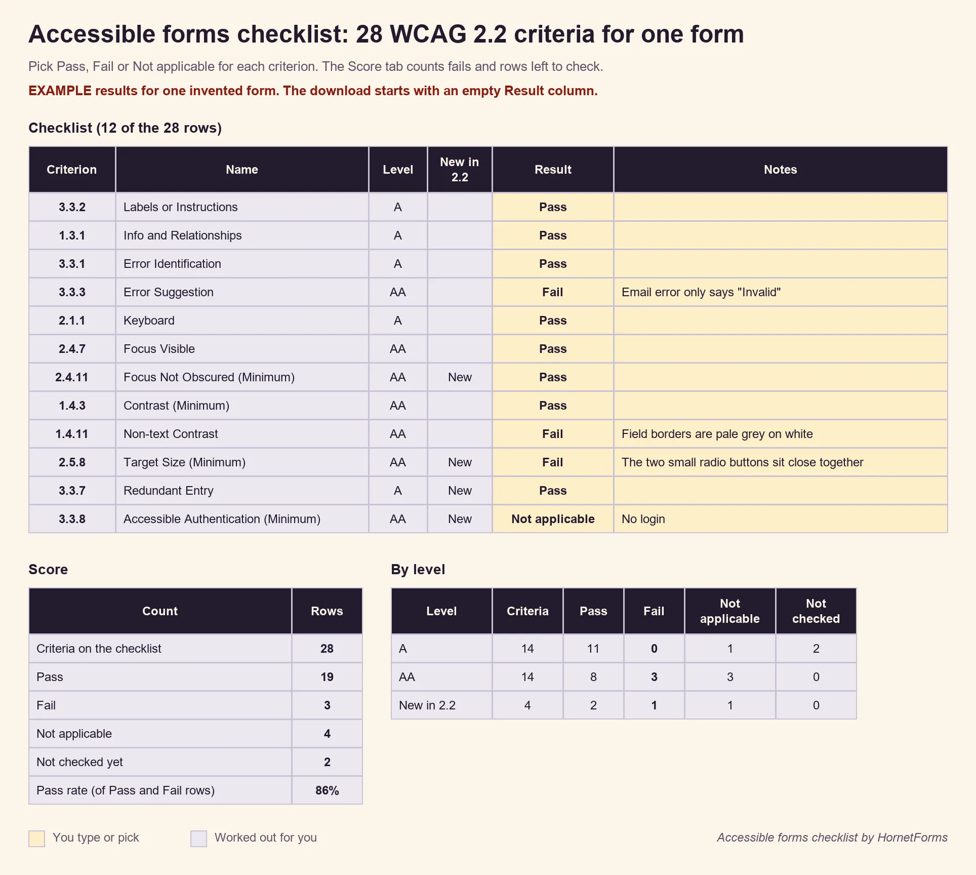
Example results only, invented for this guide. The download starts with an empty Result column.
Build accessible forms from the start#
Accessible forms come from small habits: a real label on every field, errors in words, a form that works with a keyboard, borders you can see and targets you can hit. Run the 20-minute test before you publish, and again after big changes. Coming from Google Forms? Here's how HornetForms compares. Sign up for free and test your first form against the checklist today.