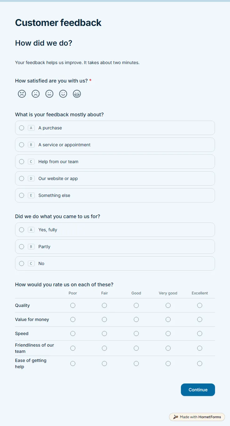
Customer satisfaction survey template (free)
A free customer satisfaction survey with a five-face CSAT question, a quality grid and a 0 to 10 recommend score. Low scores get a follow-up box.
11 questions on 2 pages
Launch week: 50% off Pro and Business with code LAUNCH50, while spots last. See pricing
A website survey template helps when your analytics show what visitors do but never why they do it. This one asks what brought someone to the site, how they found you and whether they found what they came for. Anyone who answers "Partly" or "No" gets a box to say what they were looking for. Page two asks how easy the site was to use, and a rating of three or lower opens a question about what was confusing or frustrating. A grid then rates menus, search, loading speed, readable text, look and feel and phone use, with a "Did not use" column so nobody has to guess. A hidden page_url field can record which page the visitor was on. Sign up for free, open the template and choose how it shows up on your site.
Free plan, free forever. Sign up and the template opens in your workspace.
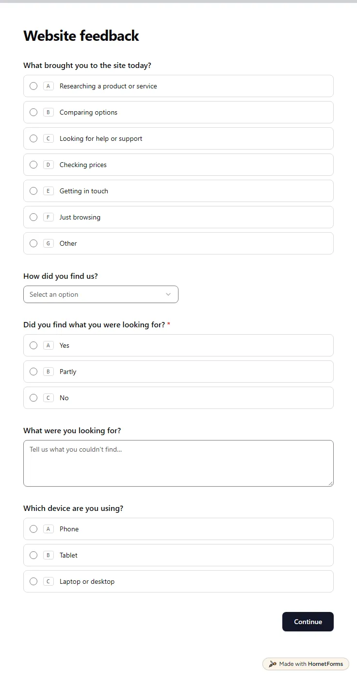
11 questions on 2 pages. Every question, in order:
Why we ask: So we can tell why people come and whether the site gives them what they need.
| No. | Question | Answer type | Required? |
|---|---|---|---|
| 1 | What brought you to the site today?Multiple choice, OptionalChoices: Researching a product or service, Comparing options, Looking for help or support, Checking prices, Getting in touch, Just browsing | Multiple choice | Optional |
| 2 | How did you find us?Dropdown, OptionalChoices: Search engine, Social media, A link on another site, An ad, Someone told me about you, I typed the address, Other | Dropdown | Optional |
| 3 | Did you find what you were looking for?Multiple choice, RequiredChoices: Yes, Partly, No | Multiple choice | Required |
| 4 | What were you looking for?Long answer, Optional | Long answer | Optional |
| 5 | Which device are you using?Multiple choice, OptionalChoices: Phone, Tablet, Laptop or desktop | Multiple choice | Optional |
Why we ask: To find the pages and features that slow people down, so we fix those first.
| No. | Question | Answer type | Required? |
|---|---|---|---|
| 6 | How easy was the site to use?Rating, OptionalScale of 1 to 5 | Rating | Optional |
| 7 | What was confusing or frustrating?Long answer, Optional | Long answer | Optional |
| 8 | How would you rate these parts of the site?Matrix, OptionalChoices: Poor, Fair, Good, Excellent, Did not useRows: Menus and navigation, Search, Page loading speed, Text you can read easily, Look and feel, Using it on a phone | Matrix | Optional |
| 9 | Page with an issue (optional)Link, Optional | Link | Optional |
| 10 | If you could change one thing about the site, what would it be?Long answer, Optional | Long answer | Optional |
| 11 | Email (if you'd like us to follow up)Email, Optional | Optional |
Thanks!
Your feedback helps us make the site better for everyone.
Hidden fields it reads from the link: page_url
The same questions, ready to print or edit.
Every response lands in your HornetForms inbox. From there, send it wherever your team already works.
Ask why people came, whether they found it and what got in the way. Then rate the parts you can change, such as navigation, search, speed and the phone layout, and finish with the one thing they would change. Keep most questions optional so a quick visitor still answers.
Yes. You can embed the form as a popup, a slider that slides in from the side, an inline block inside a page or a full page. Pick the one that interrupts least on the page where you place it.
Yes. There is a printable PDF in US Letter and A4 and an editable Word file. They are handy for user testing sessions, where you watch someone use the site and then hand them the questions on paper.
Edit the first question's reasons. A shop might add "Tracking an order", a clinic "Booking an appointment" and a nonprofit "Finding out how to volunteer". Then rename the grid rows to the parts of your site people actually use.
A free customer satisfaction survey with a five-face CSAT question, a quality grid and a 0 to 10 recommend score. Low scores get a follow-up box.
11 questions on 2 pages
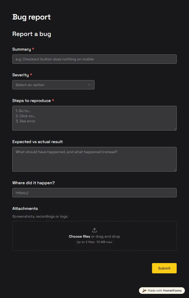
A free bug report form that asks for severity, steps and screenshots, and records the app version and browser from the link.
6 questions on one page
How to write survey questions that get honest answers: seven wording fixes, answer options, question order, a five-person test and 60 free examples.
Capture UTM parameters in a form with hidden fields, keep them in embeds, and see which campaign brought each lead. Free template and UTM sheet.
70 feedback form questions for training, workshops, events, talks, courses, services and websites, with the rating scales to use and a free question bank.
Sign up for free, pick a template and change anything you like: questions, logic and design. The Free plan stays free forever, with unlimited responses.